Brand identity
Alboroque wineries
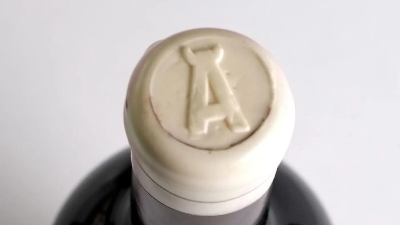
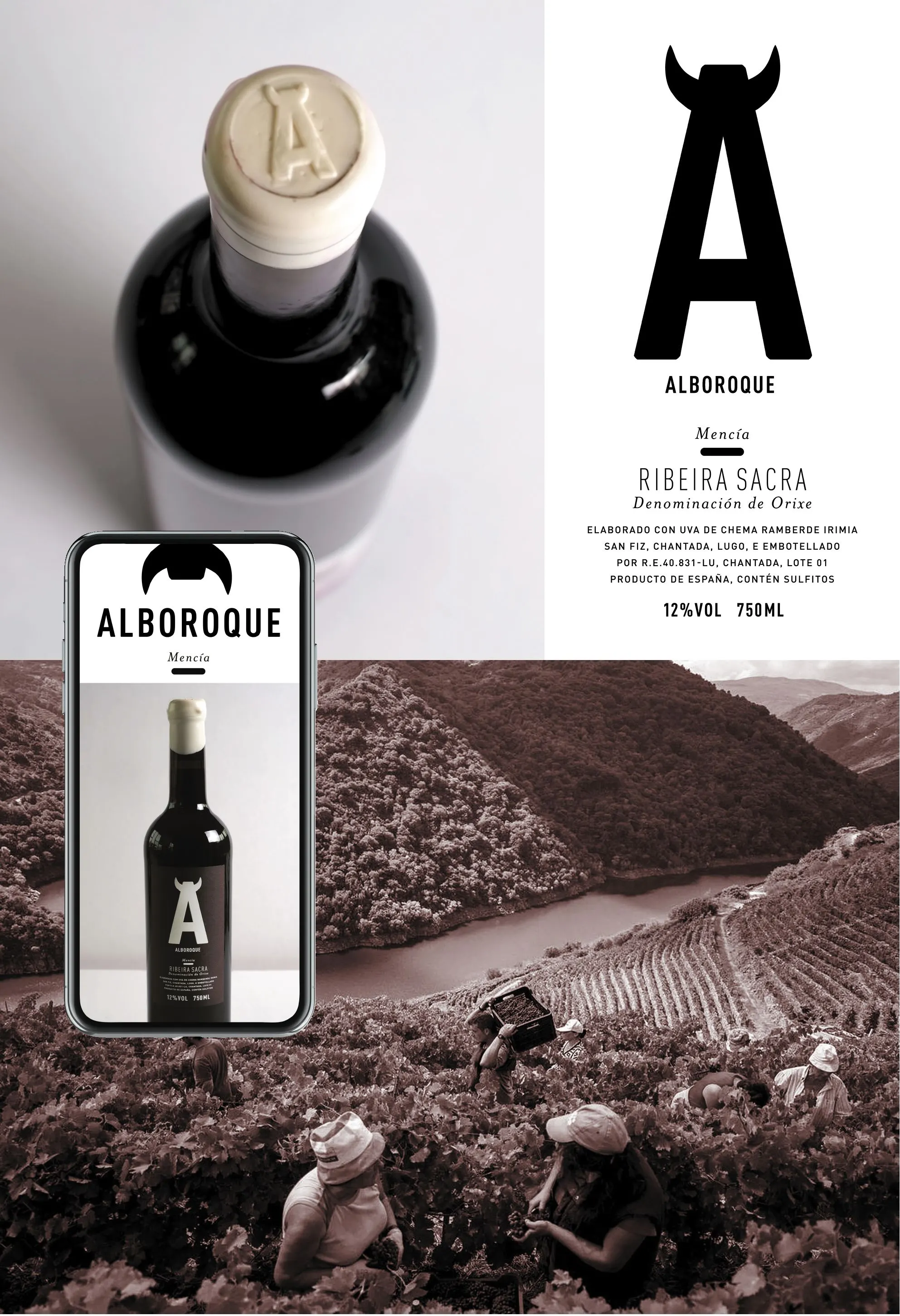
This identity development and packaging project is created as an ode to the artisans at the Alboroque wineries.
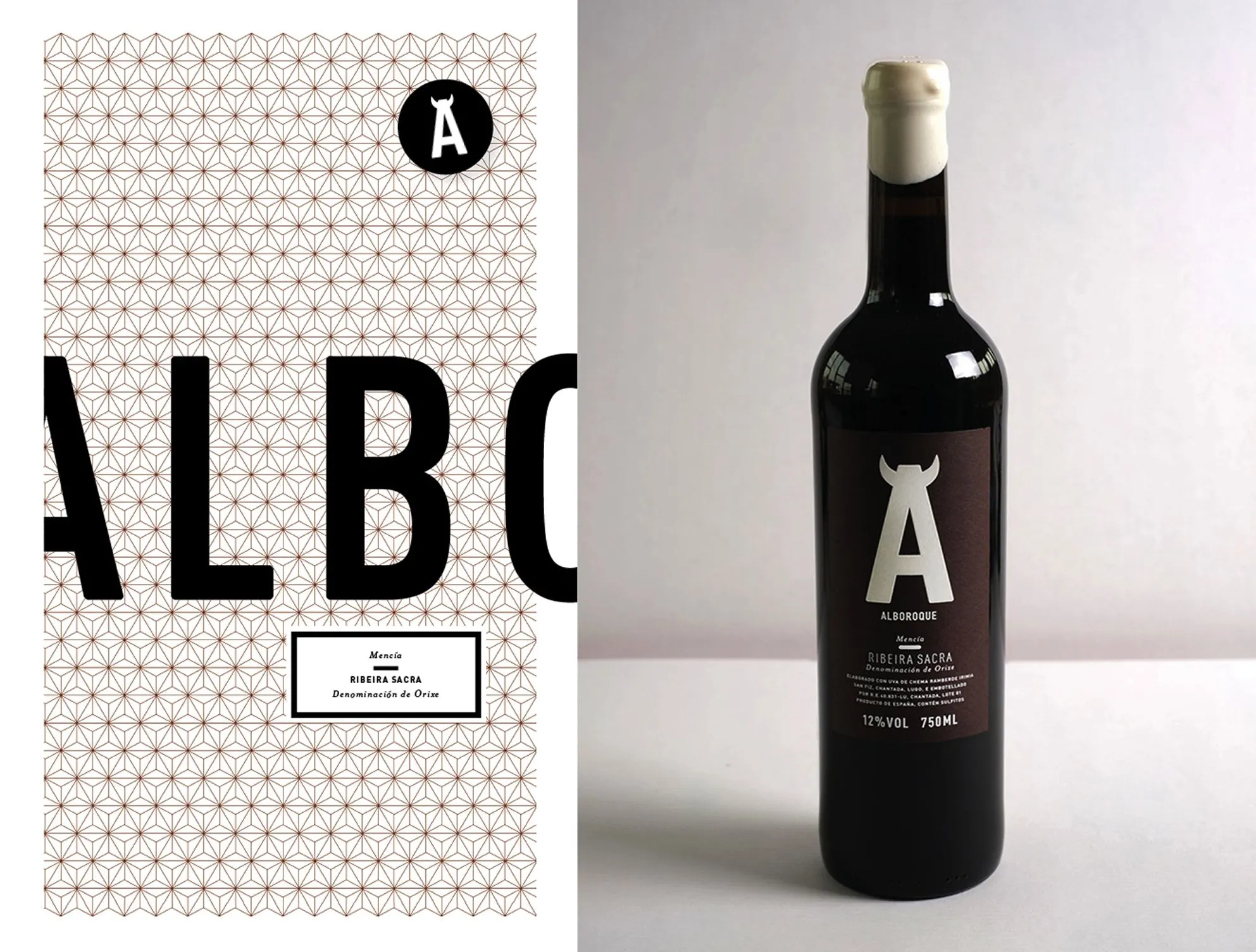
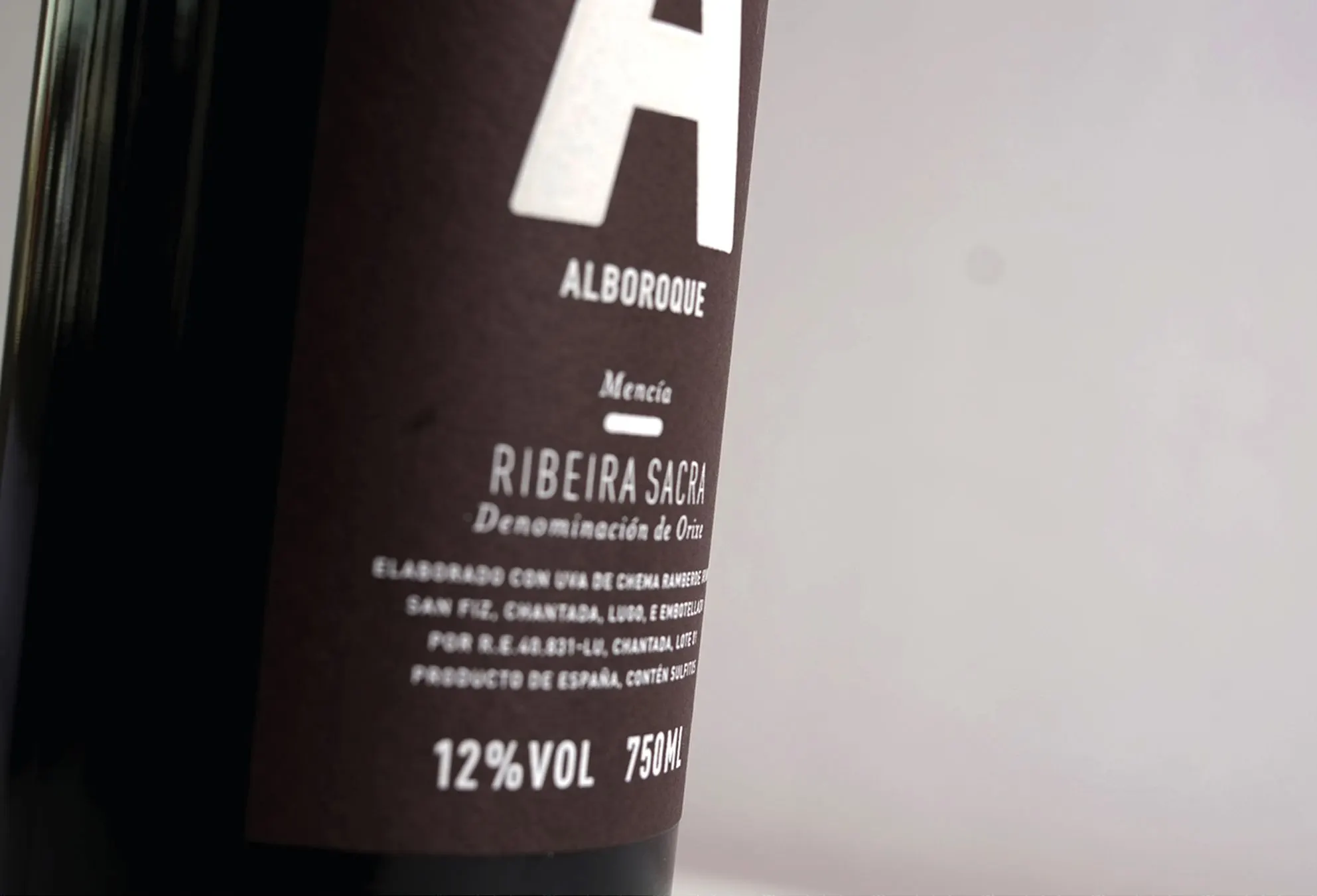
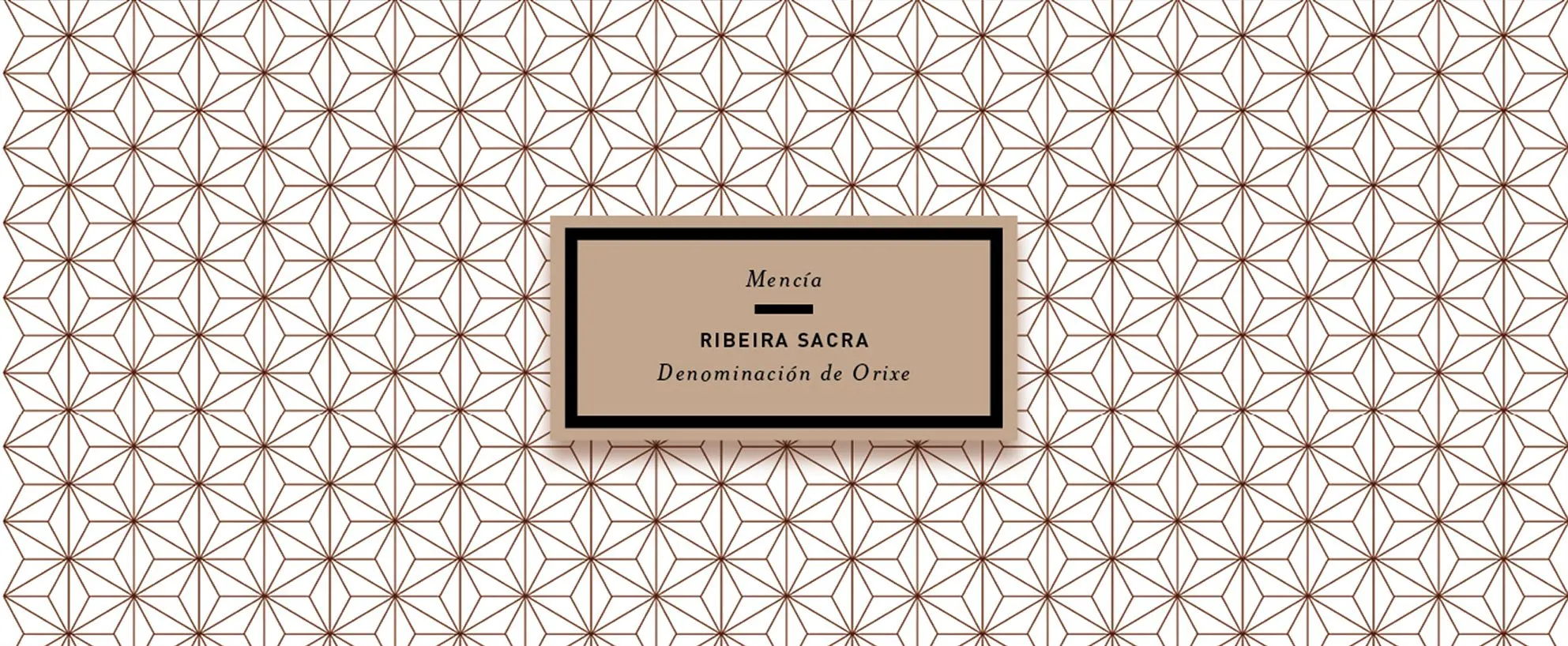
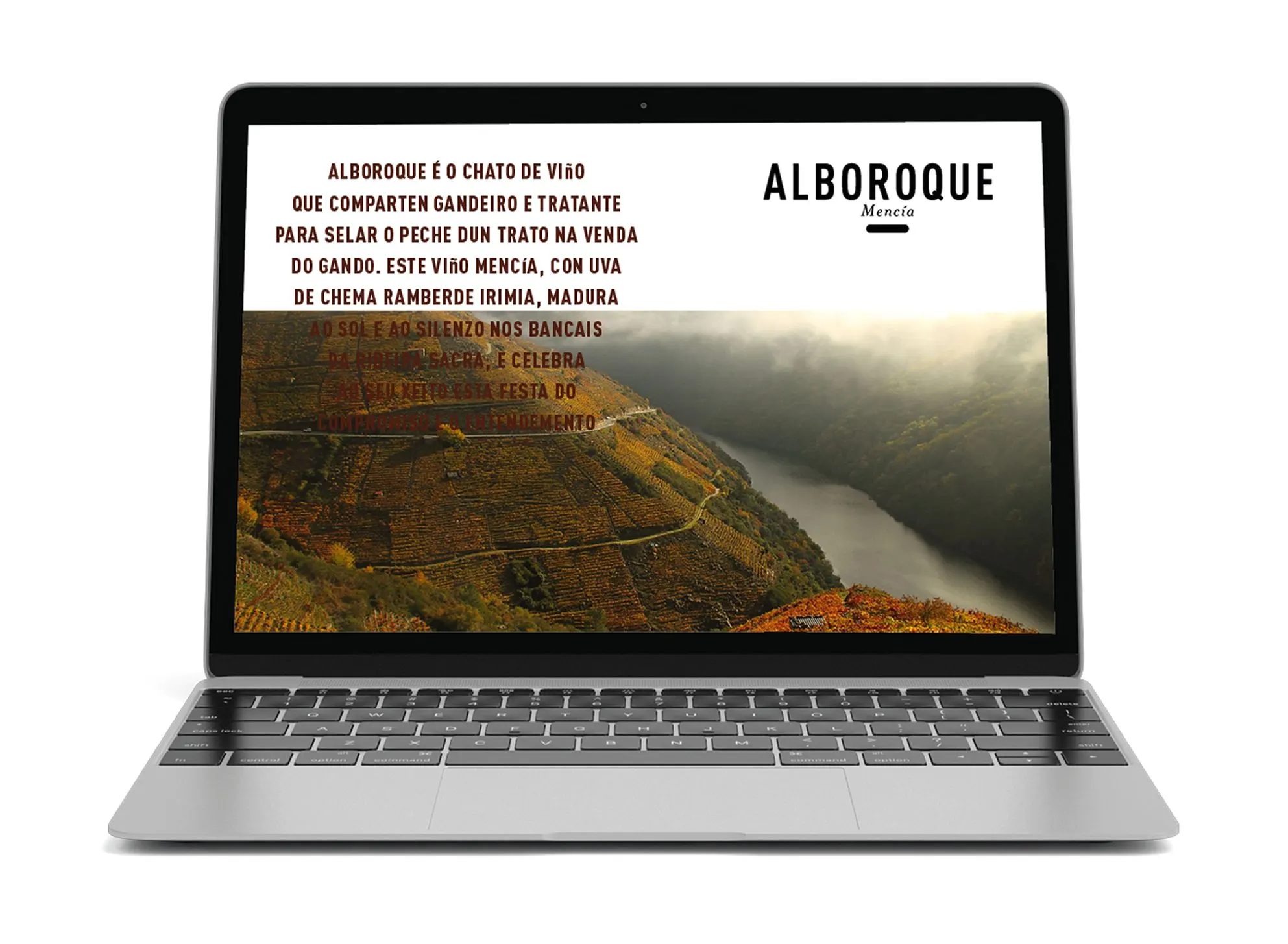
The bold clean forms and a quiet color palette draws attention to the ambiance of the beautiful region, where the Mencia grape matures to strong sun and the silence of the pristine terrace farms. The printing and finishing techniques used in the packaging emulates the ‘hand-made’ approach used in producing this wine. Some examples of this are the beeswax seal around the cork and the relief silkscreen printed label. The design language is understated and unpretentious, emphasizing the authenticity of this high-quality product and celebrating the integrity of its production process. The end product is a testament to the added value of creating consistency between good packaging and smart branding.
Credits
Monica Ragazzini, photography / Monica Ragazzini, illustration / Claudia Lasarte Saez, animation