Brand Identity
Fairfood
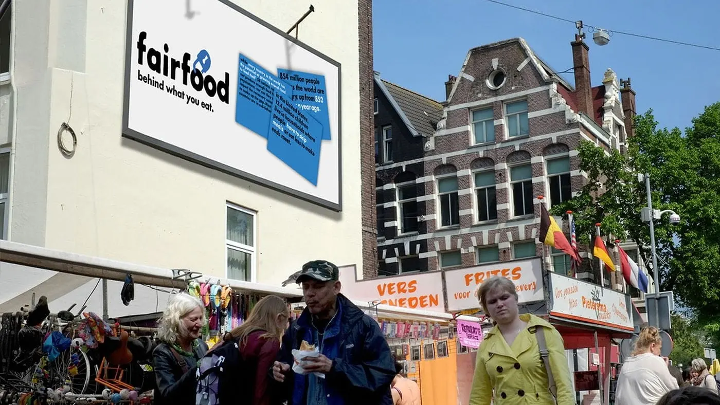
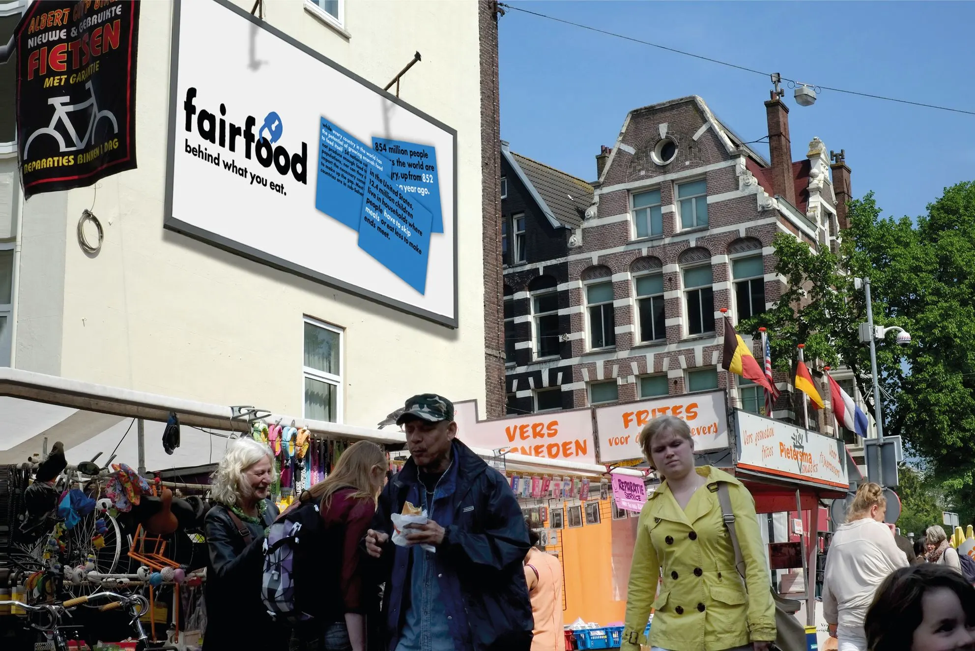
We participated in a pitch to develop a new identity for a non-profit organization. The publication was centred around revealing the agricultural processes that lead up to the food on our tables.
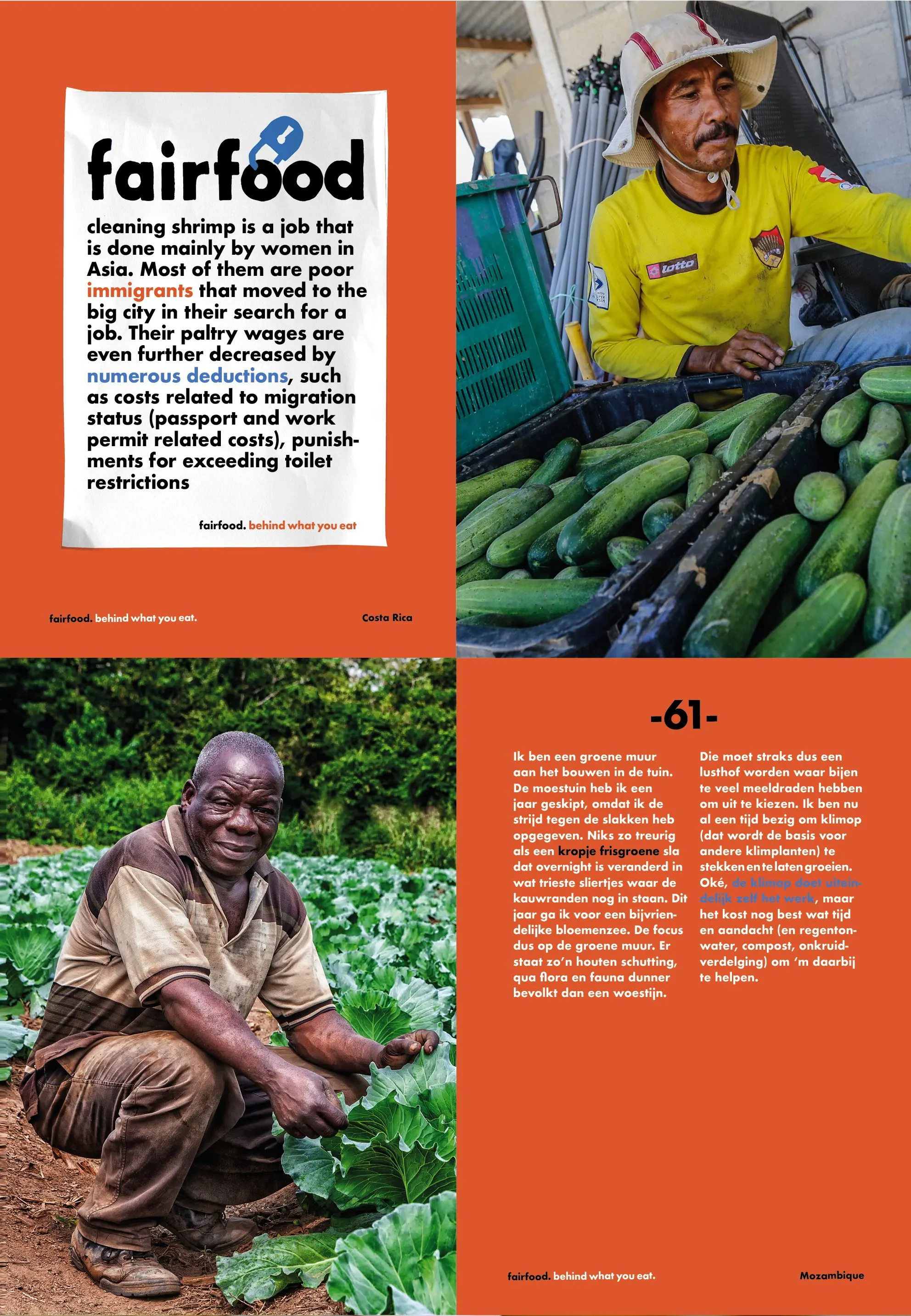
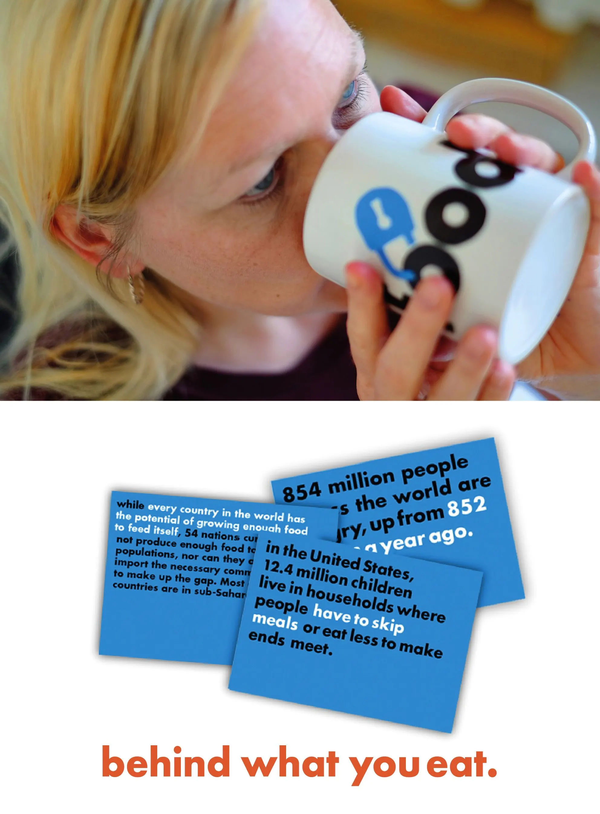
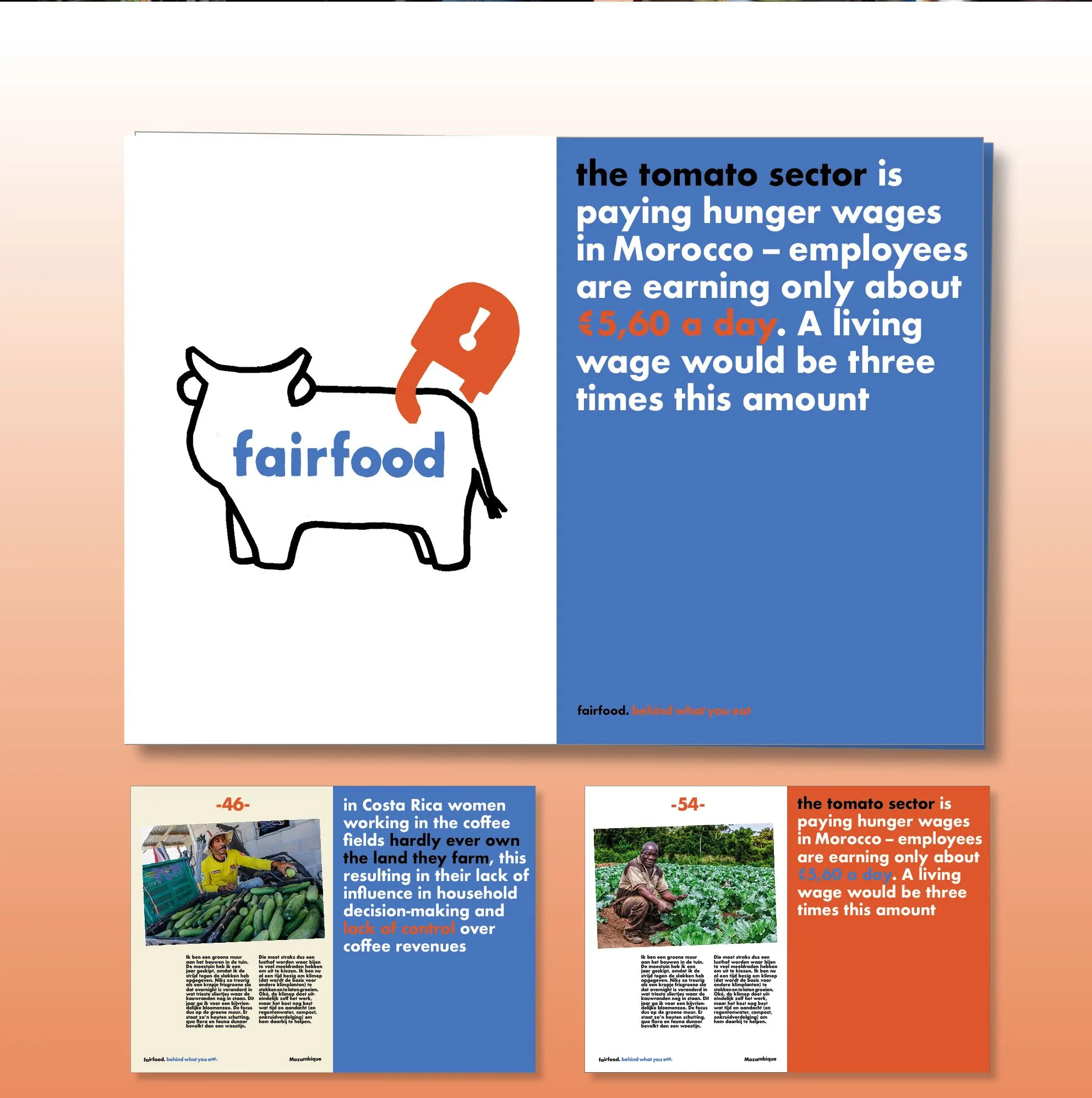
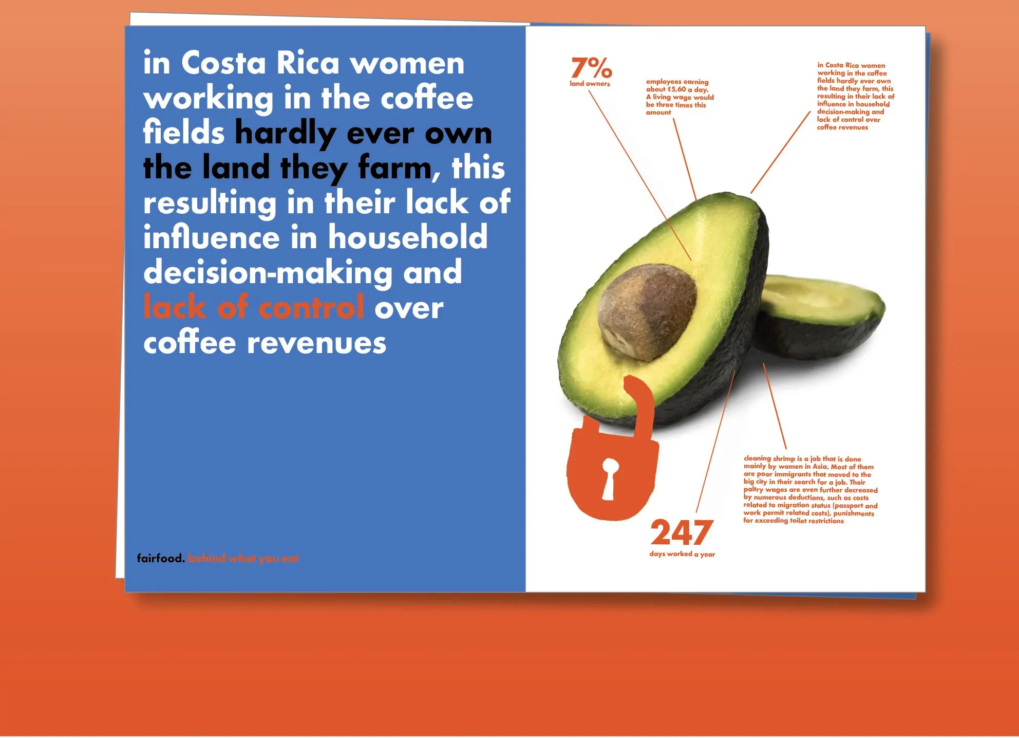
With a farm-to-table approach, we see the processes starting from the food producer to the consumers, and get an insight into all the issues that arise during this process. The content was created with the perspective of making the consumers accomplices in supporting the farmers who produce their food. We chose a clean graphic style using pictograms with a hand-drawn style. The result was bold yet friendly, which along with well-curated content and choice of graphics, helped the viewers relate more easily to the issues at hand. This pitch was successful in changing the company’s view from a classic corporate company, to a more relatable and popular one. Fairfood moved forward with a different approach but retained the essence of what was proposed by us. From a company that only addressed the rule-makers, the general public has now been made part of the narrative.
Credits
client: Fairfood / concept & design: Mariola Lopez Mariño, Lopezlab Amsterdam / illustrations: Mariola Lopez Mariño