Corporate communication
Xolvio
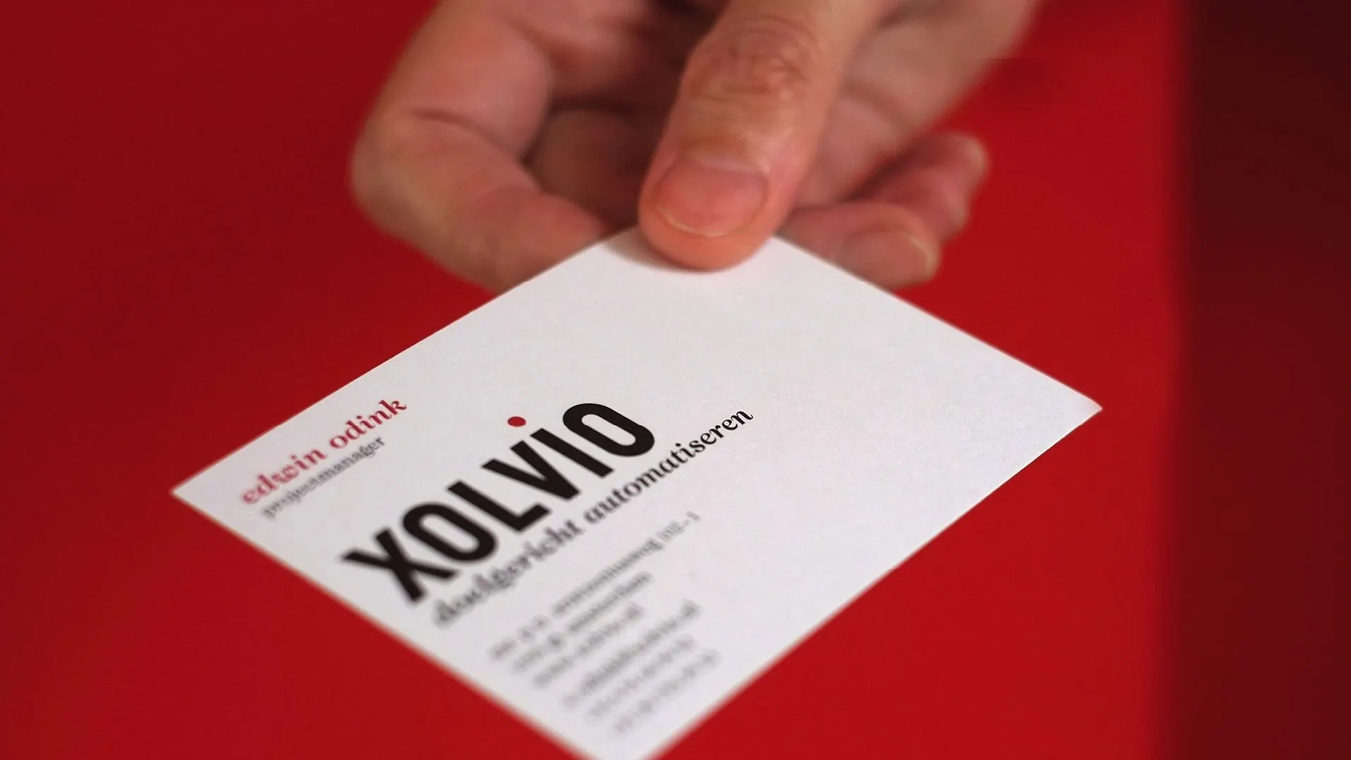
Software developers specialized in process optimisation, Xolvio required a corporate identity that reflected their methodic, systematic, and flawless approach to work.
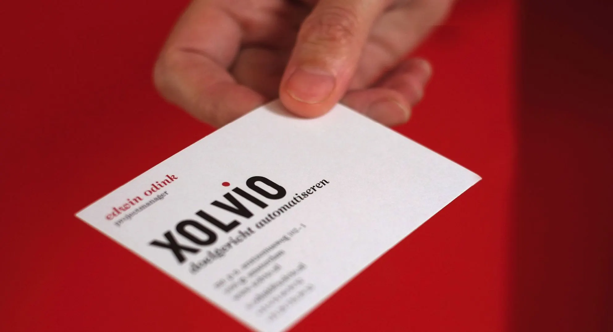
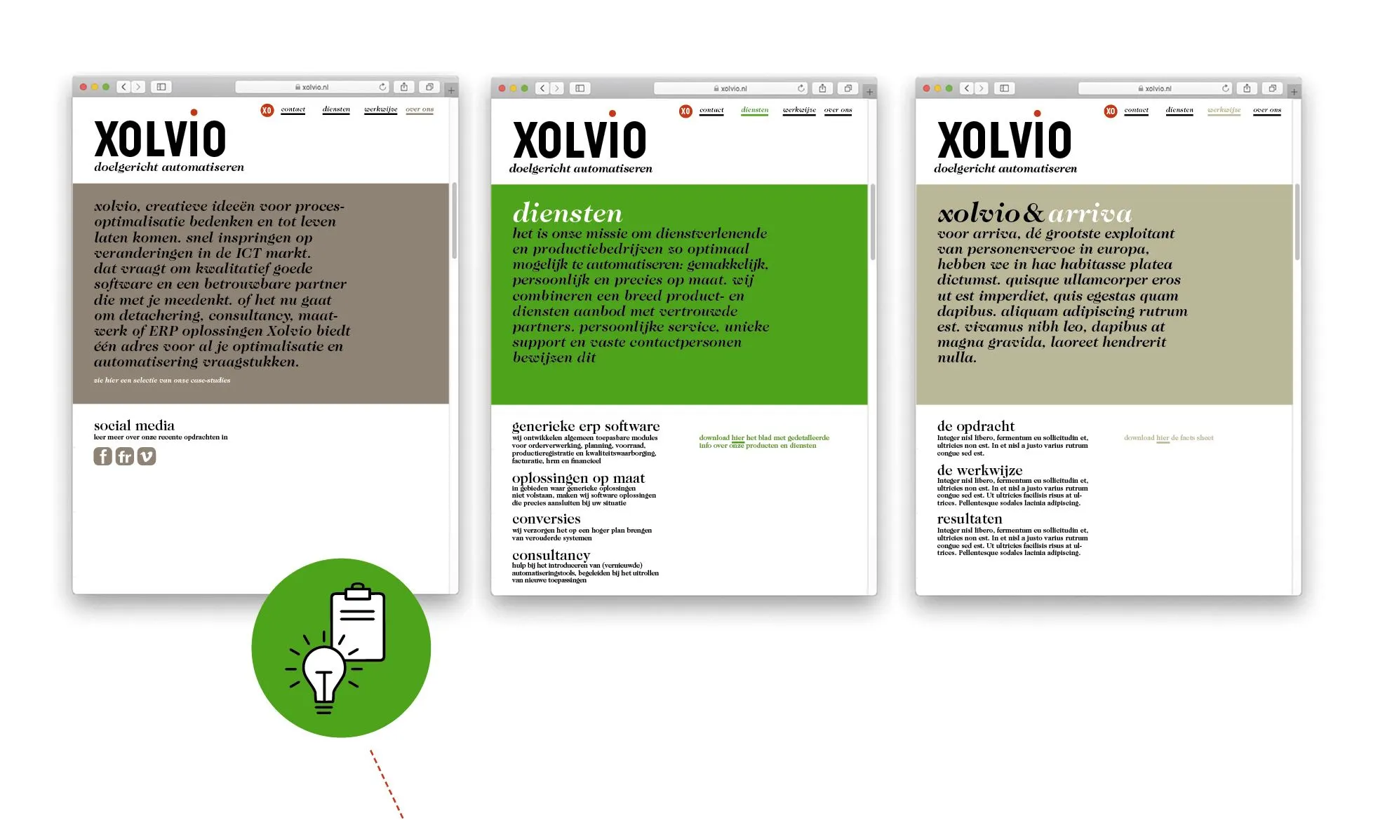
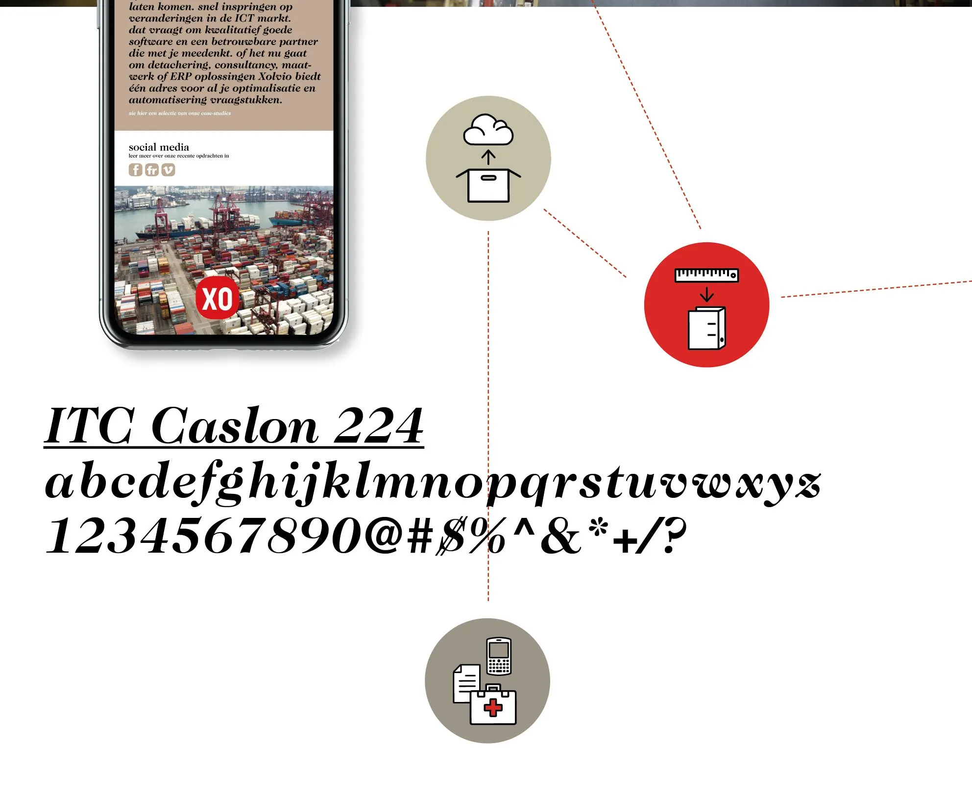
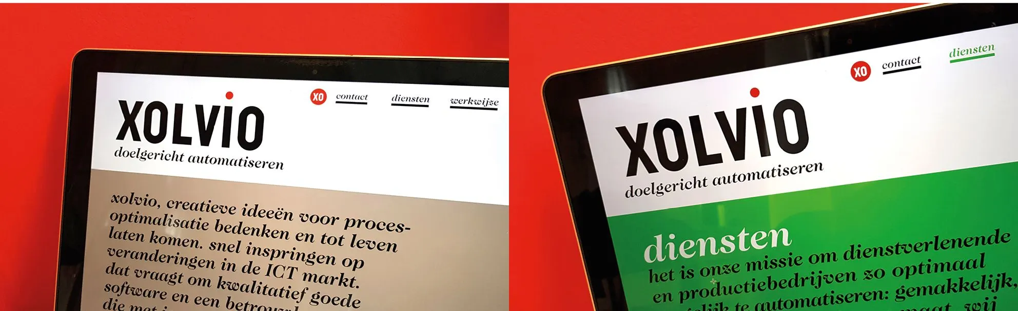
The company's core value is always to plan beyond simply applying and executing conventional techniques. We developed an identity built on this approach and incorporating their core corporate values of performance, no-nonsense, and innovation. The outcome - bold iconic logo with great graphic appeal and recall value. The logo was also easily applicable to different mediums, such as all digital platforms, company uniforms, and various other company merchandise. We also developed a series of pictograms that added visual excitement and made their systematic processes friendly and approachable for their clients. Typography evoking a newspaper-like visual language added a layer of credibility to their content, suggesting that behind the flawless technical approach there is also rich content.
The identity successfully reflected the core values of this young company. Within a year of the launch of the branding, Xolvio successfully came to the forefront of the international market.


Credits
client: Xolvio / brand concept development & design: Lopezlab Amsterdam, Mariola Lopez Mariño